March 4th, 2025
New
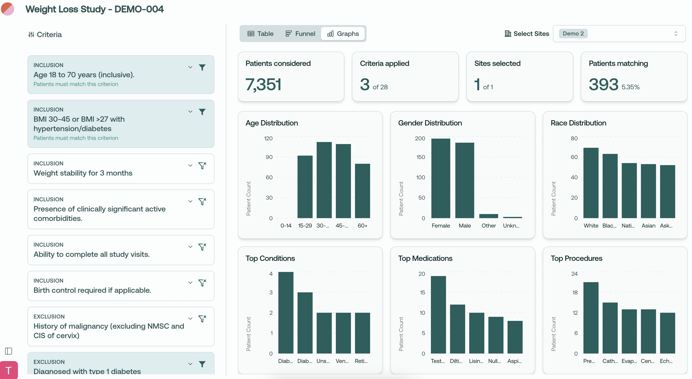
Population Analytics Dashboard: Graphs View Now Live!
Hi folks, and welcome to your product update from Trially!
We're excited to introduce an update to our population analytics giving you deeper insights into your patient populations across multiple dimensions.
Here's what's new:
Comprehensive Data Visualization
View distribution charts for key patient demographics
Analyze your patient population through multiple visual perspectives
Toggle between Table, Funnel, and our new Graphs views
Demographic Insights
Age Distribution: See patient age breakdowns across standard age ranges
Gender Distribution: Understand gender representation in your potential trial population
Race Distribution: Analyze racial demographics for better diversity planning
Clinical Insights
Top Conditions: View most common comorbidities in your matching population
Top Medications: Identify prevalent medication usage among potential participants
Top Procedures: Analyze common medical procedures your patient pool has undergone
Multi-dimensional Analysis
Select and analyze patient populations across multiple sites
See how your inclusion/exclusion criteria affect different demographic groups
Get real-time metrics showing the impact on your eligible pool
At-a-glance Summary Statistics
Total patients considered
Active criteria applied
Sites selected with clear site counter
Final matching patient count with percentage
Use Cases
Assess diversity representation in your trial population
Evaluate demographic feasibility across sites
Make data-driven decisions about inclusion/exclusion criteria
Understand the clinical profile of your potential participants
Improve protocol feedback based on real population insights
What do you think about the new Graphs view? We'd love to hear how you're using these visualizations in your planning!
Thanks for all your feedback - please keep it coming!
~ Trevor @ Trially